
In the previous installment of the postprocessing series, we showcased techniques for visualizing results on cross-sectional slices. Now, we’ll discuss how contour and isosurface plots can be used to show quantities on a series of lines or surfaces. Though they’re usable in many applications (from heat transfer to acoustics), we’ll specifically look at how they can show mechanical stress in a driving pulley and sound pressure levels in a loudspeaker.
Using Contours to Depict Stress Distributions
Contour plots are suited to show scalar quantities on a boundary of your model.
Let’s take a look at a structural mechanics example: the Stresses in a Pulley model, which involves stress in a driving pulley that’s caused by loading from the driving belt.
If you want to follow along, this model can also be found under Model Libraries > COMSOL Multiphysics > Structural Mechanics > stresses in pulley.
This particular model examines the pulley at a “frozen” moment in time (a technique known as kinetostatic analysis) and evaluates the stress and deformation at different RPMs. The solved model already has a contour plot in the results (2D Plot Group 2), where the contours show the von Mises stress at different locations in the pulley.
As seen in the image below, each contour level indicates a surface where the stress is at a constant level (specified by the color legend):
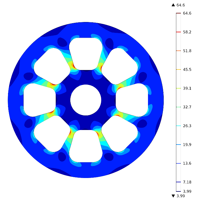
We can see that the stress is highest in the areas of the pulley that connect the inner region to the outer circle.
Let’s take a look at the contour plot’s settings window.
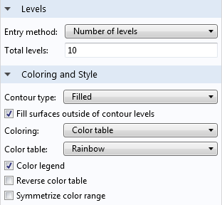
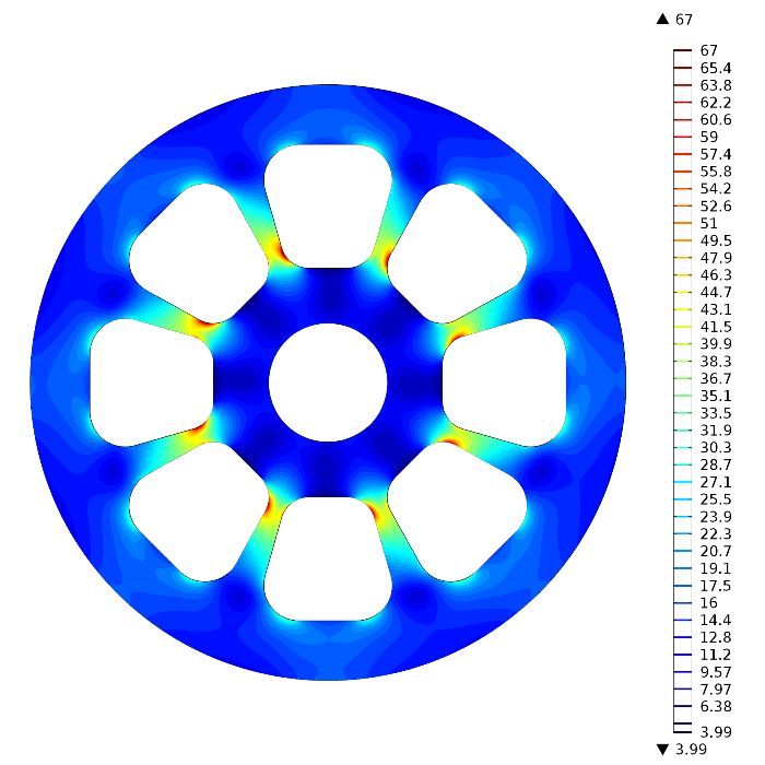
The Levels tab contains options that control the number of surfaces (levels) depicted in the plot. Adding more levels gives finer control over the surfaces and is useful in cases where you need higher precision.
The image below shows the contour plot with 40 levels instead of 10:
Now we’ll change the contour type (under the Coloring and Style tab) to Lines and use 20 levels. Instead of showing surfaces, it will now show only lines that separate each region. This can make it easier to distinguish the colors when using many levels, instead of only a few.
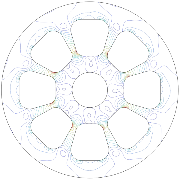
One benefit of using this type of plot in a structural mechanics case is that if the maximum allowable stress is known, then contours can immediately indicate if the threshold has been exceeded. For contour lines, there is a Level labels checkbox that appears in the settings:

If we select this, markers will appear on the plot that show which stress values correspond to which line. This conveniently offers a quick view of the values (though, of course, further evaluation is needed if contours indicate stresses close to the maximum):
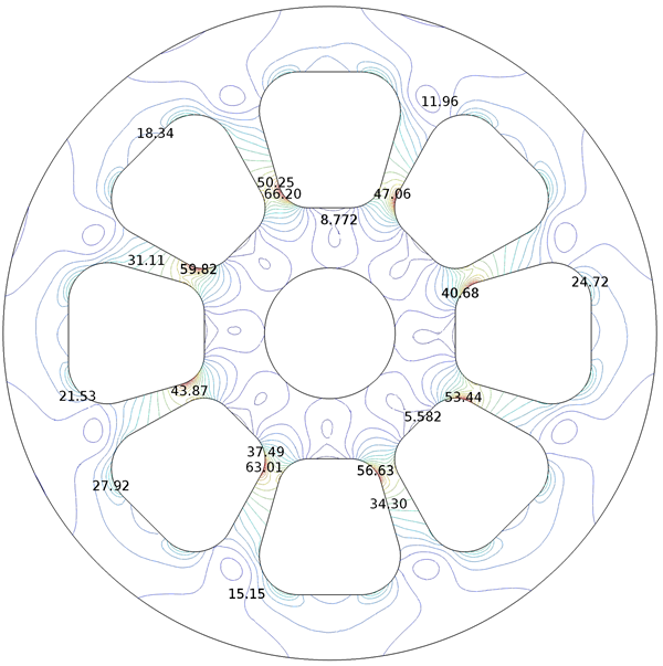
In order to visualize filled surfaces along with the stress level labels, we can simply include two contour plots: one with the labeled lines and one with filled surfaces. Plotting these together shows the boundaries of each region as a line, along with the stress surfaces for each:
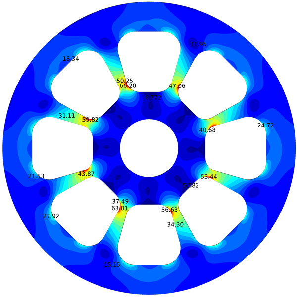
There you have it. Although we’ve explored these contour types using a structural mechanics example, these techniques are applicable to many applications. Next, we’ll take a look at the three-dimensional cousin of contour plots — isosurfaces — using an acoustics example.
Isosurfaces in Acoustics Applications
Isosurfaces, like contours, show surfaces where a quantity is constant throughout a region. However, they are not interchangeable. Isosurfaces are helpful for a variety of applications, as well. A classic example is showing the sound pressure levels in an acoustic device.
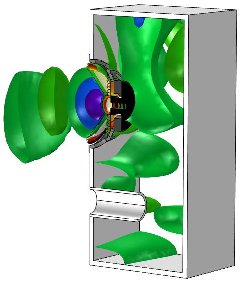
For instance, below is an isosurface plot from the Loudspeaker Driver in a Vented Enclosure model that displays the acoustic pressure in a vented loudspeaker enclosure. Again, the color legend indicates the value of the quantity on each surface, rather than showing a gradient.
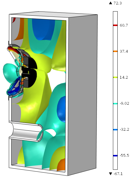
In COMSOL Multiphysics, this model is available under File > Model Libraries > Acoustics Module > Electroacoustic Transducers > vented loudspeaker enclosure, if you have the Acoustics Module installed.
Note that in COMSOL Multiphysics version 5.0, a new color table named Spectrum shows colors in a slightly different range than the Rainbow option:
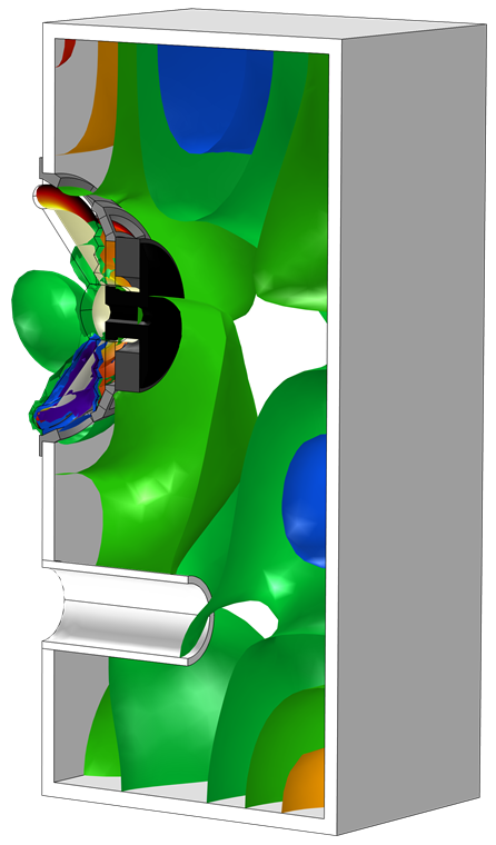
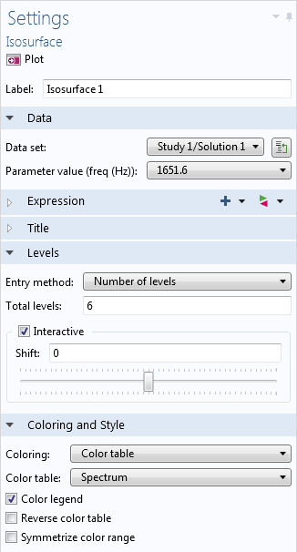
For an acoustics model like this, the settings allow us to choose the specific parameter value (frequency, in Hz) to display the isosurfaces. The image above shows acoustic pressure in the loudspeaker enclosure for a frequency of 1651.6 Hz. When the frequency is set to 1919.3 Hz, the plot looks rather different:
As with contour plots, we can specify the number of levels in the plot settings. One advantage that we don’t see with contour plots, however, is the interactive positioning tool:
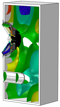
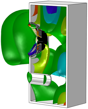
This allows us to shift all of the surfaces together by a certain factor and see live updates in the Graphics window — try it out yourself. The figures below show the isosurfaces shifted by -10 (left) and 10 (right).
That’s it for this introduction. Hopefully this has given you a good starting point for working with isosurface and contour plots. Next time, we’ll continue exploring plot types by using streamlines to depict fluid flow.
Further Reading
- Download the Stresses in a Pulley model
- Download the Loudspeaker Driver in a Vented Enclosure model
- Read the previous installment of the postprocessing series: Using Slice Plots to Show Results on Cross-Sectional Surfaces


Comments (0)