
Plotting visual simulation results on a model geometry is a great way to unveil the sometimes-mysterious physics happening behind the scenes in a device. Like learning a language, knowing how to use postprocessing tools helps designers investigate and understand their designs and processes more fully. Surface, volume, and line plots are three of the most common plot types used in postprocessing, and are applicable to many simulations.
Demonstrating the Three Plot Types in COMSOL Multiphysics
To demonstrate these three plot types, I’ll use the example of an aluminum heat sink, often used for cooling electrical circuitry components. This model is available from the COMSOL Multiphysics Model Libraries if you have the Heat Transfer Module or CFD Module.
The heat sink is made of aluminum, shaped with a cluster of pillars for cooling, and mounted on a silica glass plate. In the model set-up, it sits inside a rectangular channel with an inlet and outlet for air flow. The base of the heat sink initially experiences 1 watt of heat flux, which is generated by an external heat source.
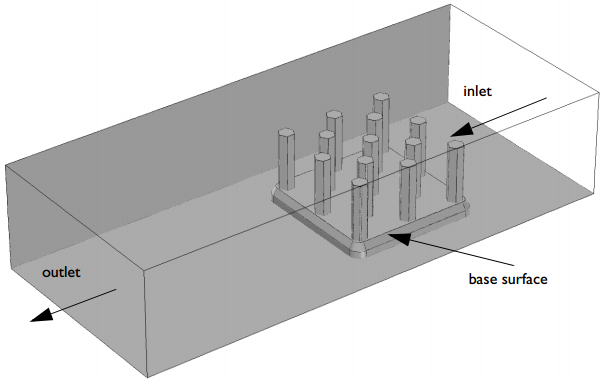
This model includes coupled thermal and fluid flow effects to analyze temperature gradients and cooling power, resulting from thermal conduction and convection.
Surface Plots
In some ways, it is easiest (visually) to use surfaces to demonstrate the plot settings in COMSOL Multiphysics. Surface plots are used to show results quantities on the boundaries of a model’s geometry. They can be added either by right-clicking the Results node of the Model Builder or by using the Results tab in the ribbon.
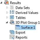
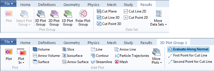
First, I’ll add a 3D plot group, and then I’ll add a surface plot to it. (When you add a 3D plot group from the ribbon, a new tab called 3D Plot Group 1 will appear and you can add surface, line, and volume plots from there, in addition to using the Model Builder.)
Adding a surface plot automatically creates a plot showing the temperature on every boundary in the geometry. However, if I simply create a surface plot, it will look something like this:
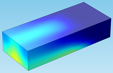
This is because the air domain is blocking our view. In order to actually see the heat sink inside, I’ll need to hide some entities. In the Model Builder, expand Component 1 > Definitions > View. The View node is where you can hide boundaries, edges, or entire domains and control the scene lighting of your model. (Take a look at my blog post about the graphics window to learn more about using the View node.)
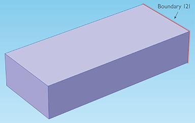
Now, I’ll right-click the View node and choose Hide Geometric Entities. I’ll set the geometric entity level to Boundary. Then, I’ll select the faces of the channel that are blocking our view of the heat sink (boundaries 1, 2, and 4). If you’re following along in the model, you might also select boundary 121, which is the channel inlet.
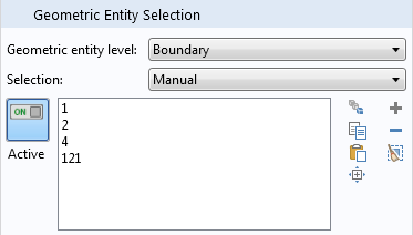
The boundaries will turn purple when clicked, indicating that they are selected.
Now, if I return to the plot group, we can see the whole heat sink:
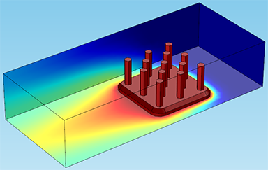
Note that choosing a selection of boundaries in a plot — similar in some ways to hiding geometric entities — allows you to show results on only the boundaries you’ve chosen. This is done by creating a solution under the Data Sets node: Right-click Data Sets and choose “Solution”, then right-click the Solution node and choose “Add Selection”. This selection works the same way as for hiding entities; set the geometric entity level to the correct type and choose the boundaries (or edges, or domains) that you want. When you create a new plot, make sure to choose this solution as the data set.
The settings for color and style make it easy to control the look of the results plots. For instance, here I’ve changed the color table to ThermalLight:
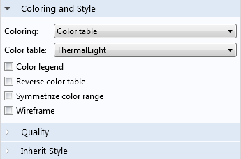
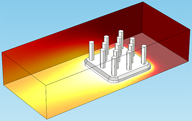
You can also control the color and data range by dragging the sliders under the Range tab. These two options allow you to visualize results on only a specific interval.
Adjusting the color range will align the colors representing the maximum and minimum temperature (white and dark red, respectively) with the chosen maximum and minimum temperatures. For instance, in the plot below, I have set the color range minimum to 320 (temperature is in Kelvin). This is helpful for cases where you’re only concerned with results inside a certain interval — so in this case, I only want to see a gradient in areas of the heat sink that are hotter than 320 K:
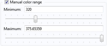
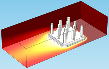
The manual data range controls something a little different. Rather than changing the color shown for a specific data range, this only plots the data interval specified by the maximum and minimum. Raising the minimum or lowering the maximum will actually remove data points from the plot:
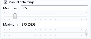
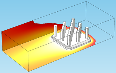
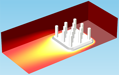
Another interesting feature of the Coloring and Style tab is a check-box under the main node (3D Plot Group 1) labeled Plot data set edges. Unchecking it will cause the plot to remove the black lines on the edges of the geometry. This is easiest to see on the plot with the altered color range, below:
Line and Volume Plots
Line and volume plots can be added the same way I added a surface plot in the previous example, by right-clicking the Results node or using the ribbon. Next, I’ll add a new 3D plot group with a line plot. Using the View node again, this time to hide the edges of the channel. I have plotted only the edges of the heat sink. This plot will show the change in temperature on the individual edges, allowing us to see clearly how the temperature is changing along the height of the pillars:
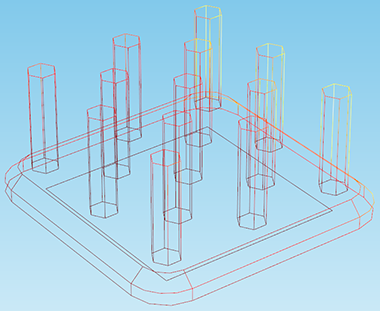
Note: All of the examples shown will use 3D plot groups, but they have an equivalent in 2D as well. For instance, in a 2D plot group, this type of plot would be used to show temperature on the edges that lie in a certain plane.
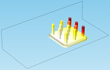
Likewise, a volume plot shows the change in a variable through an entire 3D domain. Volume plots can often save you the trouble of selecting many individual boundaries, the way you might need to for a surface plot. For instance, if I wanted to see the heat sink only, I could create a surface plot using a data set that contains all the boundaries of the heat sink. But in the figure below, I have plotted the temperature on the volume of the heat sink domain (excluding the channel domain), and we can see the temperature gradient:
Stay Tuned for More Postprocessing Techniques
That’s it for a run-down of these plot types and how to control their coloring and style! Hopefully this demonstration will help you get started in some effective postprocessing. These are just a few of the plot types available in COMSOL Multiphysics — stay tuned for future posts demonstrating other plot techniques, such as arrows, streamlines, contours, and some application-specific types. We will also demonstrate using cut line plots, which allow you to plot any quantity along an arbitrary line through the model.


Comments (0)