Creating a Deep Neural Network Surrogate Model from Imported Data
Before covering how to create physics-based surrogate models, we will discuss how to develop surrogate models based on imported data that can easily be visualized. Using data that can easily be visualized enables you to immediately determine a surrogate model's effectiveness in replicating original data. Taking a closer look at this approach will offer insight into the creation of surrogate models and how they can be expected to perform.
Fitting Imported Data with Linear Interpolation
In this first example, the dataset consists of a set of point coordinates and function values sampled from a function surface,  , that is presumed unknown. We would like to create a surrogate model based on this data using a deep neural network (DNN) model. The workflow corresponds to a case where the data originates from experimental results. For this first example, we will choose a dataset with two input parameters and one output parameter, or quantity of interest, since such low-dimensional data is very easy to visualize and a great way to get started. Later on in the course, when we apply surrogate models to higher dimensional data, visualization becomes more challenging.
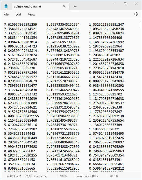
The point cordinates and function values are stored in a text file. The beginning of this text file appears in the figure below. It is available for download here.
In the finite element case, the corresponding tabulated data would consist of columns for input parameter values and output quantity values.
The set of points defined by the text file can be visualized as follows, from two different vantage points:
 A set of numerous black dots in 3D space viewed from a normal perspective.
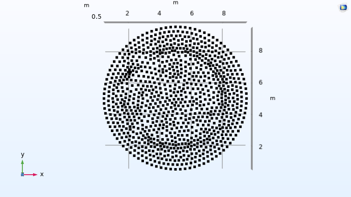 A set of numerous black dots in 3D space viewed from the xy-plane.
The point-cloud-visualization model file is available for download here.
We can see from these visualizations that the xy-coordinates of the points appear to be located inside of a circle in the xy-plane. This circle is centered at (x, y) = (5, 5) with a radius of 4.5.
We can easily apply piecewise linear interpolation to this dataset by using an Interpolation function in COMSOL Multiphysics®. To do so, start by choosing the Blank Model option in the Model Wizard. Then, add an interpolation function by right-clicking Global Definitions and selecting Interpolation from the Functions menu. In settings for the interpolation function, choose File as the Data source and browse to the point cloud data text file. Click Plot in the Settings window to visualize the data, as shown in the figure below.
 The Model Builder with the Interpolation function node selected and the corresponding Settings window and Function plot.
The settings for the interpolation function.
The Model Builder with the Interpolation function node selected and the corresponding Settings window and Function plot.
The settings for the interpolation function.
Here, the linear interpolation function int1(x,y) is visualized on a rectangular domain of definition. For values outside of the circle in which the original data is available, by default, the function applies extrapolation by assigning a constant value based on the nearest points on the circle's edge (there are several other extrapolation options). This can be seen more clearly if we view the plot generated from above.
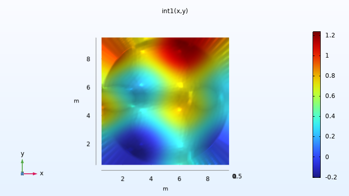
A visualization of the xy-plane view of the dataset.
Since we don't know the values outside of the original dataset, the values used for extrapolation are somewhat arbitrary. Similarly, different surrogate modeling techniques implement extrapolation in distinct ways. When using a surrogate model, it is often important to avoid using values in the extrapolated regions since they may not be representative of the real data. However, for numerical reasons it is useful to get sensible values in a small region outside of the original data's domain of definition.
The model file for the linear interpolation function example is available for download here.
Fitting Data with a Deep Neural Network
Let's now approximate the same dataset using a deep neural network instead of linear interpolation. Unlike linear interpolation, which creates a function that exactly passes through all data points, this approach will not necessarily interpolate the data but instead aim to approximate it. This process, where the model is optimized to minimize the overall prediction error across the dataset, is often referred to as regression.
Open the model file containing the linear interpolation function example. Select the Deep Neural Network option from the Global Definitions > Functions menu. (If you have a Component node in your model, you can alternatively add surrogate models under the Component > Definitions node.) In the Settings window for the Deep Neural Network node, browse to the point cloud data text file and click Import.
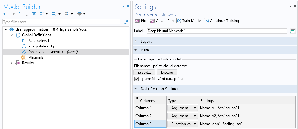 The Model Builder with the Deep Neural Network function node selected and the Data and Data Column Settings sections of the Settings window expanded.
The point cloud data text file is imported in the settings for the Deep Neural Network node.
The Model Builder with the Deep Neural Network function node selected and the Data and Data Column Settings sections of the Settings window expanded.
The point cloud data text file is imported in the settings for the Deep Neural Network node.
Note that as an alternative, you can import the data into a table using the Tables node, under the Results node, and then reference the table by selecting the Results table option from the Data source menu.
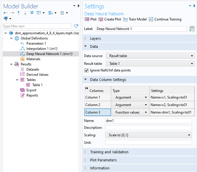
The data for the Deep Neural Network function imported using a results table.
In the Data Column Settings section, the system automatically identifies two input Argument columns and one Function values column, defaulting to the names x1, x2, and dnn1, respectively. You have the option to rename these columns as desired. You can call the function from different locations in the user interface using the syntax dnn1(x1, x2), dnn1(x, y), or similar expressions, depending on your chosen input argument names and the specific context in which the function is used.
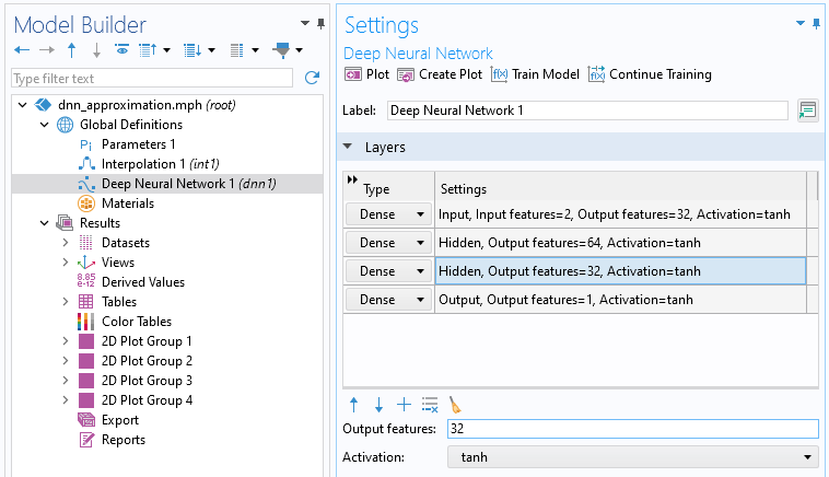
We design a neural network by adding network layers in the Layers section of the Deep Neural Network node Settings window. Different strategies for designing these layers, as well as the role of the Activation function, are discussed here. For now, we will just create a neural network with 3 hidden layers and 4, 8, and 4 nodes, respectively, and leave all other settings at their default values. We can use the notation  to represent this network configuration. Use the Add button, the one with a Plus icon, in the Layers section to add layers. Change the Output features to 4, 8, and 4 for the first, second, and third row in the table, respectively. The Output features from one layer defines the number of neurons in the next layer. The Layers section should now appear as follows:
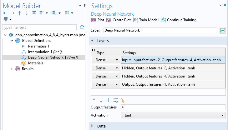
The Layers section of the Settings window.
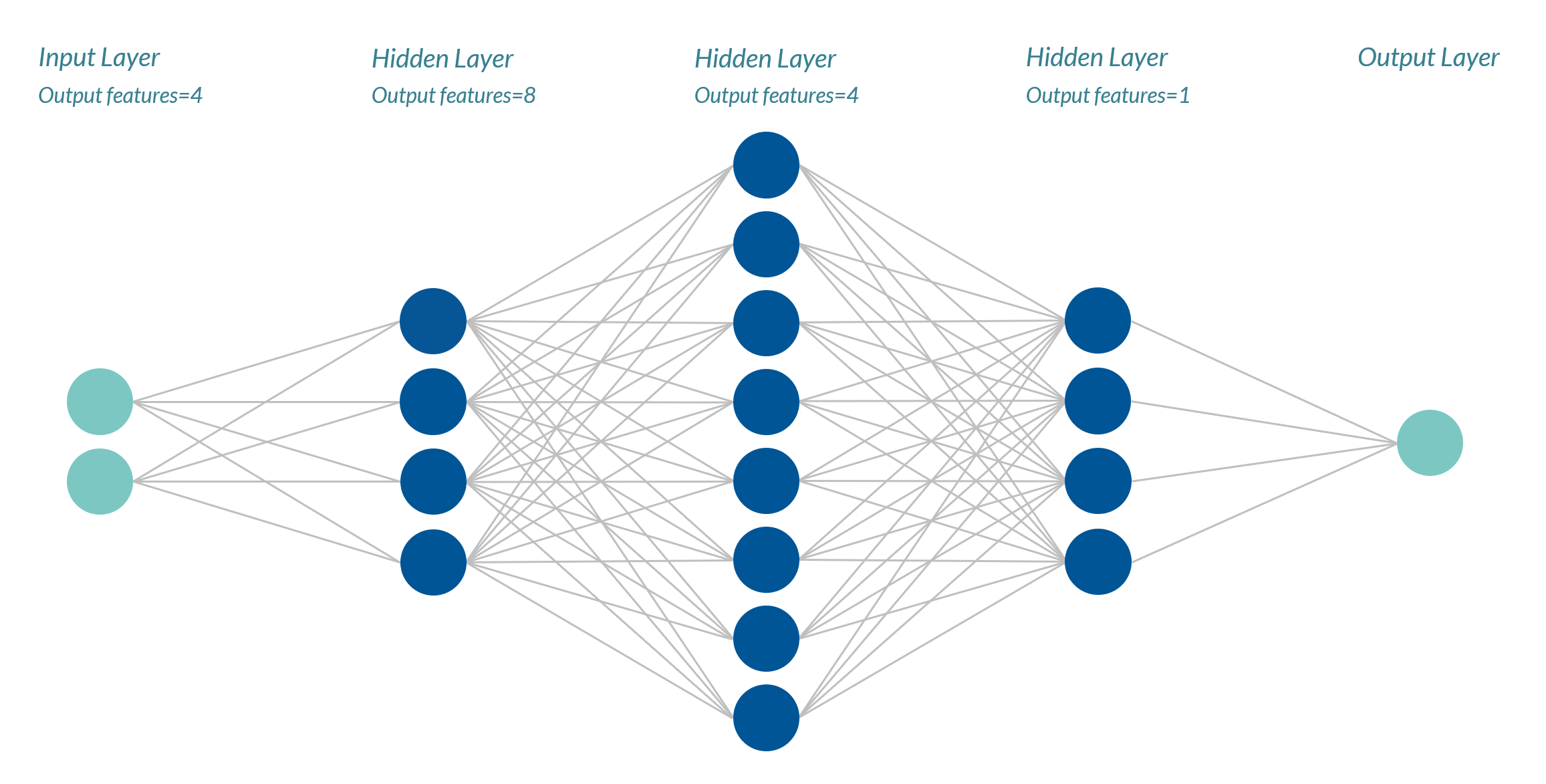
These settings correspond to the following network:
 A column containing two cyan circles, a column containing four dark blue circles, a column of eight dark blue circles, another column of four dark blue circles, and then a column containing one cyan circle, which are connected through a series of lines and show a mesh-like structure.
The neural network architecture for the surrogate model being developed.
Notice that in the table with the layer definitions, the first and last row, for the Input and Output layers, respectively, have a special status. For the first row, the number of Input features, and for the last row, the number of Output features, are set indirectly by the Data Column Settings. This means that the Output features setting in the last row of the table will be overridden by the number of columns of the Functional values type. In other words, you never need to modify the value for the Output features of the last layer.
Training the Network
We are now ready to train the network. When training a neural network, the values for the weights and biases of the network are optimized to fit the data as closely as possible. So, in this context, when we say that we are training a network, we simply mean that we are running an optimization solver for optimizing the weights and biases of the network. Following this terminology, the coordinate and function value data in the text file are called the training data.
Think of the network weights as the factors that influence how much each input affects the output. Biases, on the other hand, allow the network model to adjust the output along with the weighted inputs to better match the data. It's like setting the baseline or the starting point from which adjustments are made. By optimizing these weights and biases, the aim is to create a neural network model that can predict new data accurately based on what it has learned from the training data.
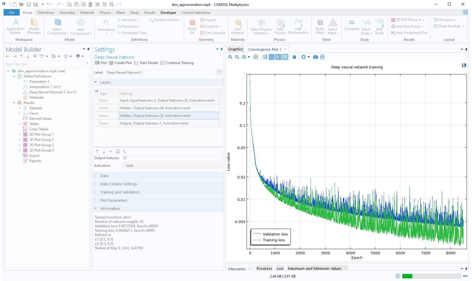
To train the model, click the Train Model button at the top of the Settings window for the Deep Neural Network function. During the training process, you can monitor the convergence in a Convergence Plot.
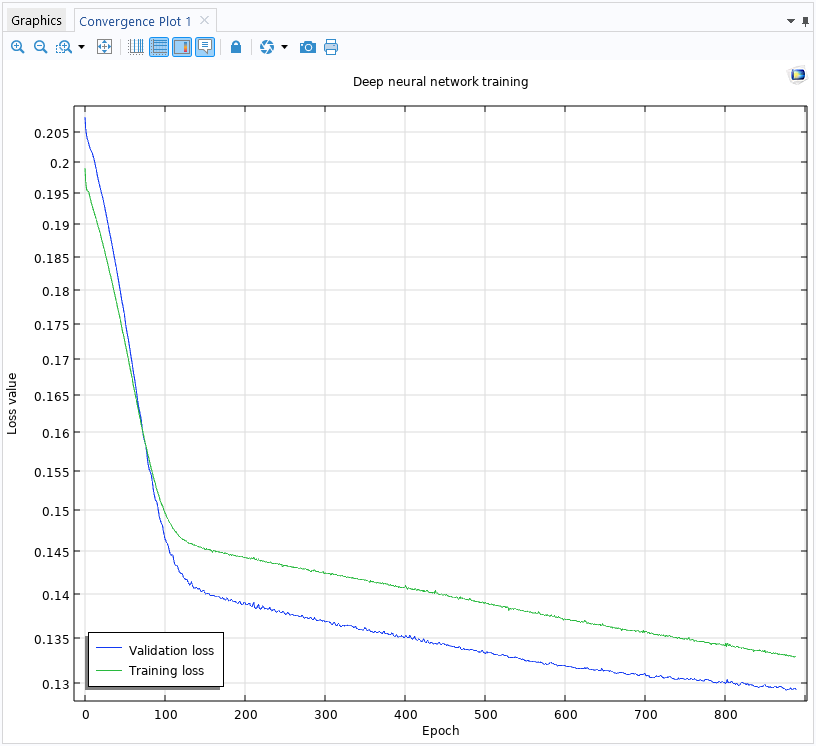 The convergence plot generated while training the deep neural network.
The Convergence Plot window displays the Validation loss and the Training loss vs. Epochs. The number of epochs refers to the number of complete passes through the entire training dataset by the solver. In this case, a loss function is a function that measures the error in the approximation. The Training loss shows the loss function with respect to the main part of the training data. A randomly selected portion of the data is set aside as an unseen dataset specifically for validation, representing the Validation loss.
In more detail, the training loss measures how well the neural network fits the training data. It decreases as the model learns during training. The validation loss measures the model's performance on the validation data. It gives an estimate of how well the model will generalize to new, unseen data. If the training error becomes too low and the validation error is high, the model might be overfitting, meaning it is learning the training data too closely and may perform poorly on unseen data.
In the Settings window for the Deep Neural Network function, in the Training and Validation section, you can find the optimization solver parameters, also known as hyperparameters. The hyperparameters are tuned to find a balance where both training and validation loss are minimized, indicating the model has learned well and can also generalize well to new data. You can read more on this here.
In addition to the convergence graph, you can find training information in the Information section of the Settings window of the Deep Neural Network node, as shown below.
Note that the screenshot shows the Information section as it appears in version 6.2. In version 6.3, this section includes more detailed information.
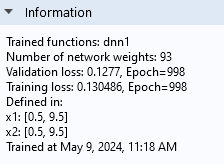
The Information section of the Settings window.
The default loss function is a root-mean-square error (RMSE) loss function and is defined as:

where:
 is the number of data points,
 is the actual value of the target variable for the 55349;56406; -th sample point,
and  is the predicted value output by the neural network for the 55349;56406; -th sample point.
If the sample points are from the validation dataset, this defines the validation loss; otherwise, it defines the training loss.
We can see from the convergence plot that by running the optimization solver for a larger number of epochs, we should be able to get a lower loss. Let's increase the number of epochs from the default 1000 to 50,000.
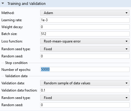
The Training and Validation section settings.
Click Train Model to start the training. For the first 10,000 epochs, the Convergence Plot appears as follows:
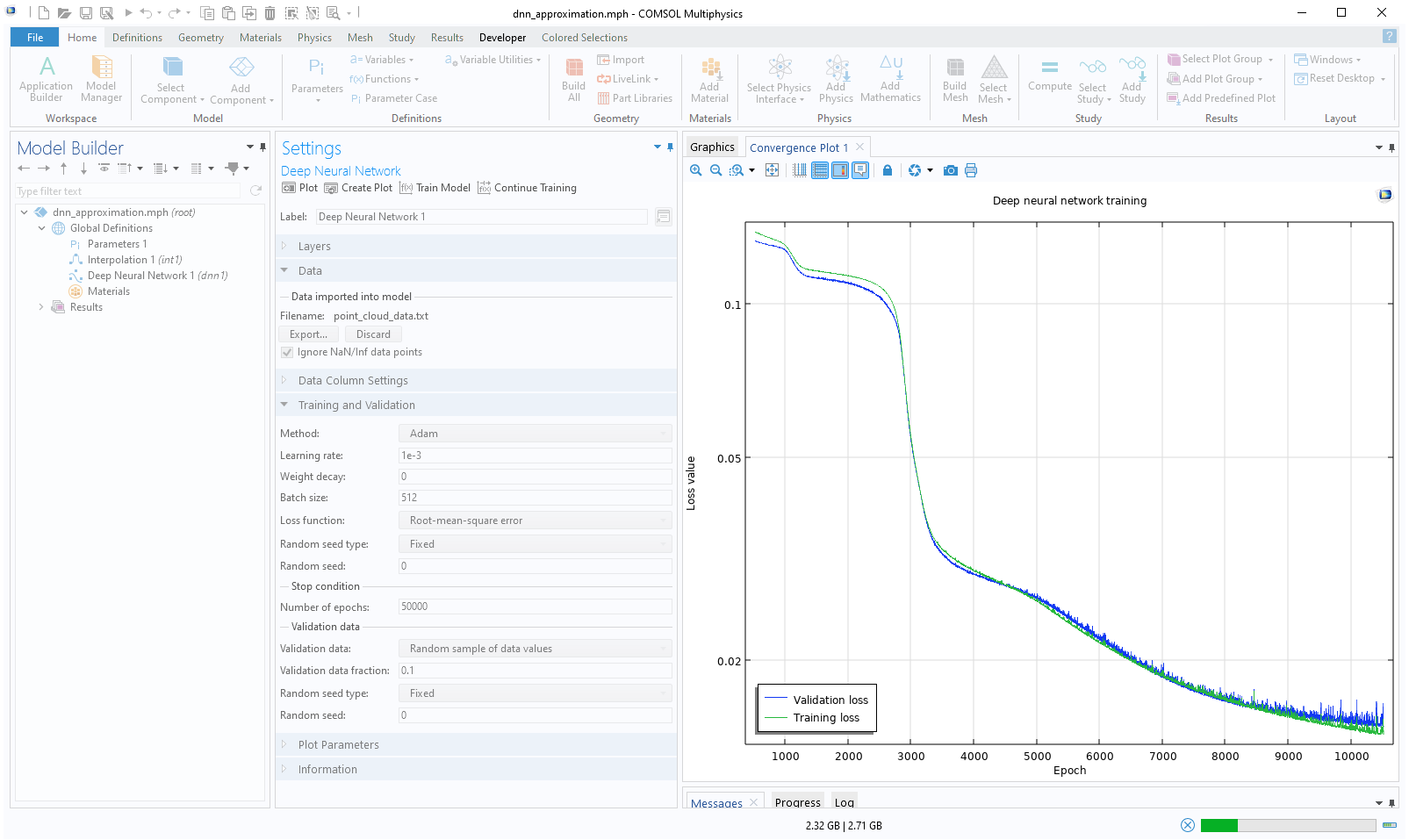 A screenshot of the Model Builder after the Train Model button has been clicked, in which the Convergence Plot is generated and the Model Builder is disabled.
The convergence plot generated after increasing the value for the number of epochs.
A screenshot of the Model Builder after the Train Model button has been clicked, in which the Convergence Plot is generated and the Model Builder is disabled.
The convergence plot generated after increasing the value for the number of epochs.
For the final epochs, the Convergence Plot appears as follows:
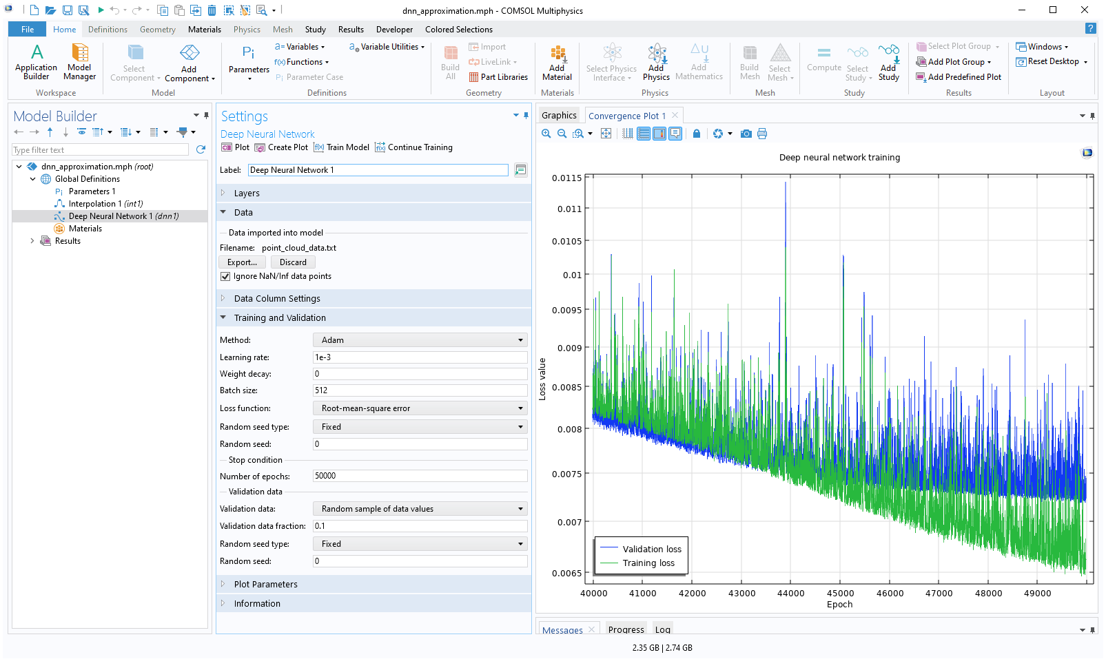 The Model Builder with the DNN function selected in the model tree and the corresponding Settings window and convergence plot.
The convergence plot for the final epochs.
The Model Builder with the DNN function selected in the model tree and the corresponding Settings window and convergence plot.
The convergence plot for the final epochs.
Note that the screenshot shows the Convergence Plot as it appears in version 6.2. In version 6.3, the plot will have a slightly different appearance. Additionally, due to the stochastic gradient method used, the convergence behavior may vary between different computers or when running with a different number of cores.
We can see here that the validation loss is starting to flatten out. This is usually a sign that we have reached the limit of how well this particular network configuration can fit and generalize the data. If the validation loss starts increasing while the training loss is still decreasing, it usually indicates overfitting. Overfitting refers to a model that performs very well on its training data but poorly on unseen data, such as the validation data. If you notice that this happens during the optimization process, you can click the Stop button in the progress window. This is known as early stopping and is a common technique used to avoid overfitting. When you click Stop, the result from the epoch with the lowest validation loss up to that point will be used as the output of the training, even if that epoch occurred earlier than the one at which you stopped. Note that even if you don't stop early, COMSOL® will use the weights and bias with the lowest validation loss in the trained model.
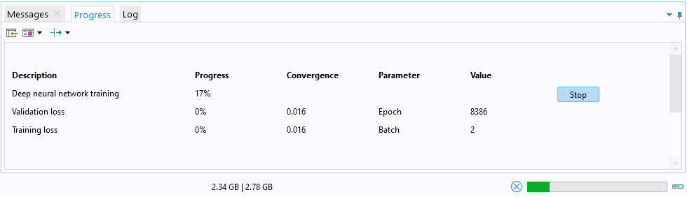 The Messages/Progress/Log window with the Progress tab opened, showing a tabular display of the progress for training the surrogate model.
The Progress window, which can be used to stop the training by clicking the Stop button.
The Messages/Progress/Log window with the Progress tab opened, showing a tabular display of the progress for training the surrogate model.
The Progress window, which can be used to stop the training by clicking the Stop button.
The Information section tells us that the Validation loss is about 0.0072 and that the Training loss is about 0.0065. The fact that they are similar in magnitude indicates that we have avoided overfitting.
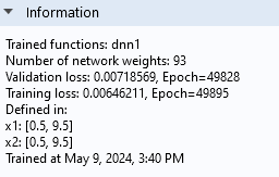
The Information section of the Settings window.
Note that the Information section also tells us the number of weights, or parameters, of the neural network model. In this case, there are 93 parameters. In this window, the bias parameters are counted as weights.
The model file for the neural network function example above is available for download here.
Visualizing the Quality of the Fit
Even if the loss function values give us information on how well the neural network model performs, we might want to get more precise information, such as how the quality of the fit is distributed in space. We can visualize this by plotting the difference between the linear interpolation function and the neural network function. The linear interpolation function more or less gives us the raw training data (with added linear interpolation and constant-value extrapolation), and we can easily compare the neural network function against it.
To visualize the neural network function, click the Create Plot button in the Settings window. This generates the following plot:
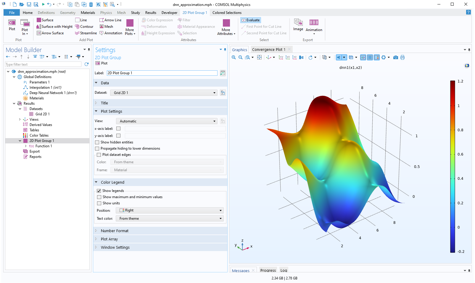 The Model Builder with the 2D Plot Group 1 node selected and the corresponding Settings window and Graphics window, which contains a rainbow surface plot in 3D space of the neural network function.
The neural network function visualized in the Graphics window.
The Model Builder with the 2D Plot Group 1 node selected and the corresponding Settings window and Graphics window, which contains a rainbow surface plot in 3D space of the neural network function.
The neural network function visualized in the Graphics window.
The plot is of the type Function and is generated relative to a Grid 2D dataset where the limits of the x and y coordinates are automatically identified and applied. In this case, both the x and y values vary between 0.5 and 9.5. In the Grid 2D dataset, the parameter names are automatically set to be x1 and x2 for x and y, respectively (though we can change the names if we want to).
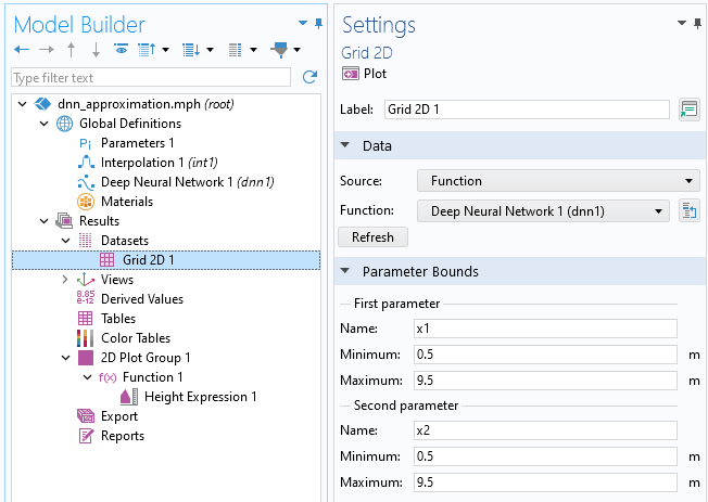
The settings for the Grid 2D dataset node.
Let's now create plots to compare the linear interpolation function with the neural network function. Start by changing the Function setting in the Grid 2D dataset from Deep Neural Network 1 (dnn1) to All. This will enable us to reuse this dataset for other functions.

The function selection in the Grid 2D dataset has been changed to All.
Next, right-click the Results node and select 2D Plot Group. Right-click this plot group and select Surface. In the Expression field, type int1(x1,x2). This is the expression for the linear interpolation function. The generated plot appears as follows:
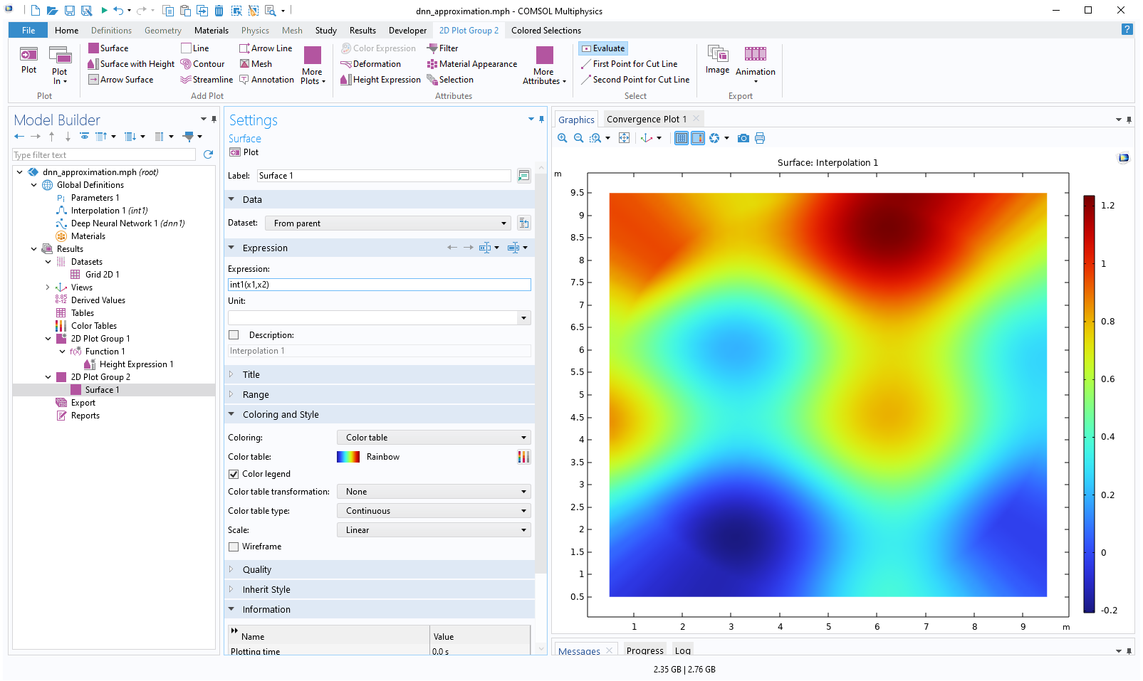 The Model Builder with the Surface 1 node under 2D Plot Group 2 selected and the corresponding Settings window and Graphics window, which displays a 2D plot of a square with a rainbow color distribution.
A surface plot of the linear interpolation function.
The Model Builder with the Surface 1 node under 2D Plot Group 2 selected and the corresponding Settings window and Graphics window, which displays a 2D plot of a square with a rainbow color distribution.
A surface plot of the linear interpolation function.
Depending on the aspect ratio of your Graphics window, you might need to adjust the settings in the View 2D node used by the plot. To do so, go to the first View 2D > Axis node (there may be several View 2D nodes) under the Views node and select None for the View scale setting, as shown below.
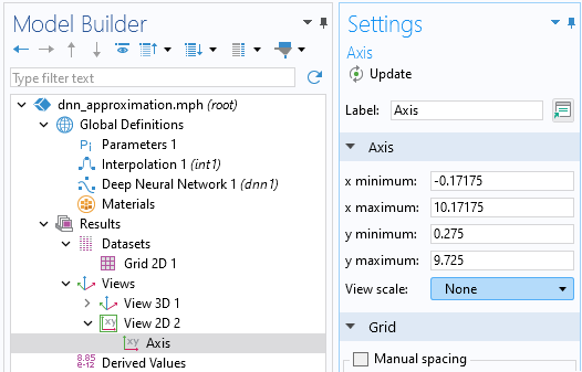
The Axis subnode settings.
Then, go to the newly added 2D Plot Group node and change the View setting from Automatic to the View 2D node you just modified.
The plot settings for the 2D plot group.
This will ensure that the aspect ratio of the plot is 1:1.
In the same way, add another 2D Plot Group with a Surface feature and type dnn1(x1,x2) as the Expression. Reference the same View as for the linear interpolation function plot.
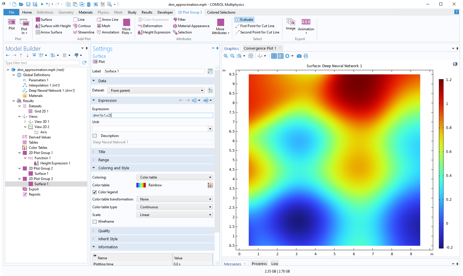 The Model Builder with the Surface 1 node under 2D Plot Group 3 selected and the corresponding Settings window and Graphics window, which displays a 2D plot of a square with a rainbow color distribution.
A surface plot of the deep neural network function.
The Model Builder with the Surface 1 node under 2D Plot Group 3 selected and the corresponding Settings window and Graphics window, which displays a 2D plot of a square with a rainbow color distribution.
A surface plot of the deep neural network function.
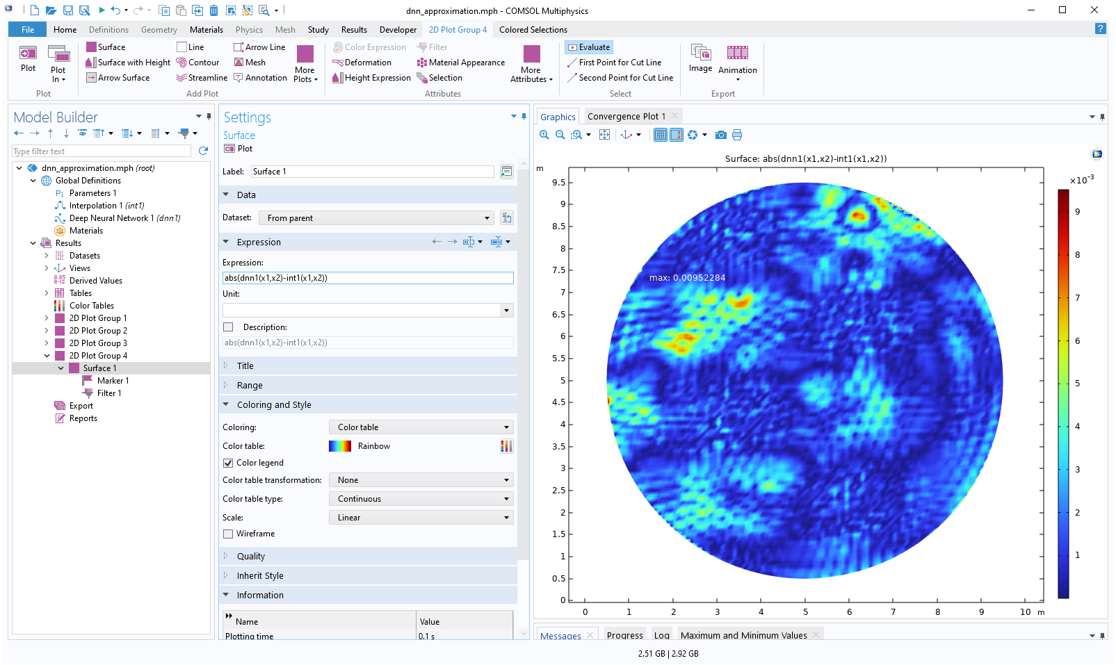
Add yet another 2D Plot Group, add a Surface feature, and type abs(dnn1(x1,x2)-int1(x1,x2)) as the Expression. This enables us to visualize the local absolute difference between the linear interpolation function and the neural network function. Change the view settings as before. The resulting plot appears as follows:
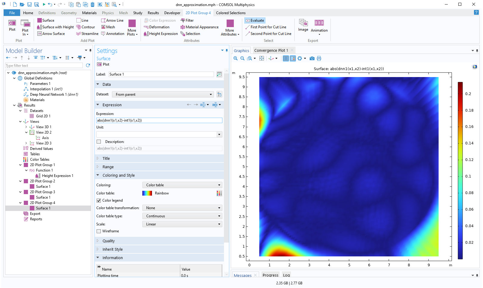 The Model Builder with the Surface 1 node under 2D Plot Group 4 selected and the corresponding Settings window and Graphics window, which displays a 2D plot of a square with a rainbow color distribution that is a majority navy blue.
A surface plot of the absolute difference between the linear interpolation and deep neural network functions.
The Model Builder with the Surface 1 node under 2D Plot Group 4 selected and the corresponding Settings window and Graphics window, which displays a 2D plot of a square with a rainbow color distribution that is a majority navy blue.
A surface plot of the absolute difference between the linear interpolation and deep neural network functions.
The absolute difference is about 0.2 in the extrapolation regions. Now, add a Marker feature to the Surface plot to more clearly see the maximum difference. To do so, right-click the Surface plot and select Marker. In the Settings window for the marker, change the Display setting to Max.
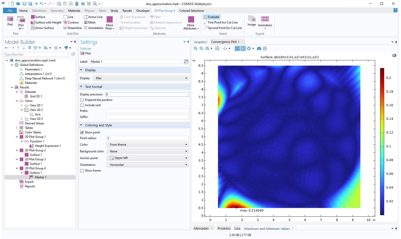 The Model Builder with the Marker 1 node selected and the corresponding Settings window and Graphics window, which displays a black point and text label at the max value of the plot.
The settings for the Marker subnode.
The Model Builder with the Marker 1 node selected and the corresponding Settings window and Graphics window, which displays a black point and text label at the max value of the plot.
The settings for the Marker subnode.
We can see that the max value is about 0.21.
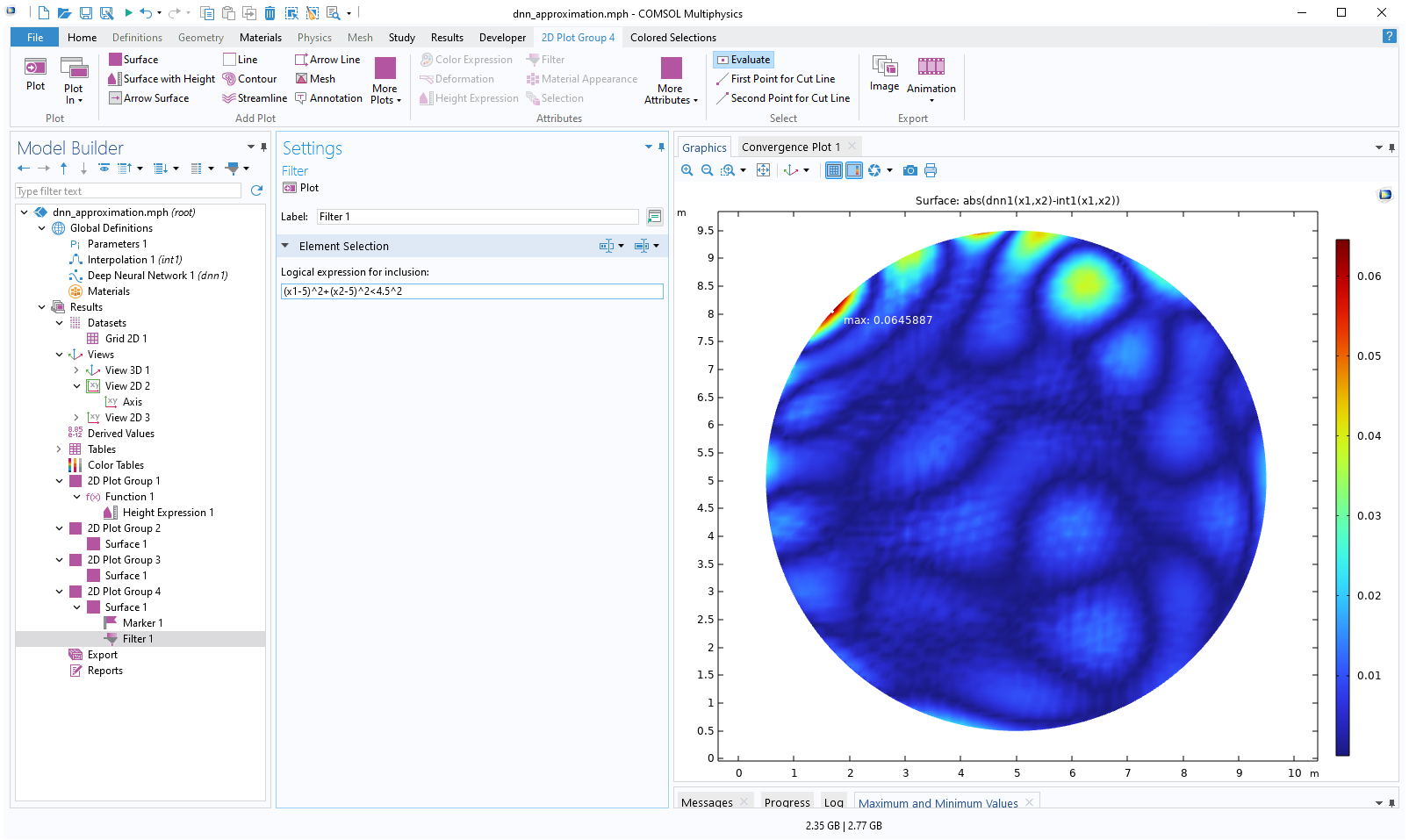
We might not be interested in the maximum difference in the extrapolated region, but we would rather like to visualize the difference inside of the circle, which is the domain of definition of the dataset. We can achieve this by using a Filter feature.
Right-click the Surface node and select Filter. For the Logical expression for inclusion, type: (x1-5)^2+(x2-5)^2<4.5^2.
This is an inequality for extracting the interior of the circle. The resulting plot is as follows:
 The Model Builder with the Filter 1 node selected and the corresponding Settings window and Graphics window, which displays a 2D plot of a circle with a rainbow color distribution that is a majority navy blue.
The absolute difference inside of the circle is visualized.
The Model Builder with the Filter 1 node selected and the corresponding Settings window and Graphics window, which displays a 2D plot of a circle with a rainbow color distribution that is a majority navy blue.
The absolute difference inside of the circle is visualized.
Now, the maximum value is about 0.065. Here, the Color setting of the Marker feature has been changed to White for better visibility.
Using a Larger Network
Let's now try to increase the quality of the fit by increasing the complexity of the network. In the Deep Neural Network node Settings window, change the number of nodes per hidden layer to 32, 64, and 32, respectively. The new network configuration is  .
.
The Layers section of the settings for the DNN function.
Click Train Model to start the training. The model will take longer to train when additional nodes are added to its layers. This is because adding nodes increases the number of parameters in the model (both weights and biases), which in turn raises the computational complexity. More parameters mean that the model must perform more calculations during each iteration of training, thus extending the training time.
 A screenshot of the Model Builder after the Train Model button for the DNN function has been clicked, in which the Convergence Plot is generated and the Model Builder is disabled.
The convergence plot for the first 8000 epochs for a DNN with 32, 64, and 32 nodes in its layers.
A screenshot of the Model Builder after the Train Model button for the DNN function has been clicked, in which the Convergence Plot is generated and the Model Builder is disabled.
The convergence plot for the first 8000 epochs for a DNN with 32, 64, and 32 nodes in its layers.
 The Model Builder with the DNN function selected in the model tree, the corresponding Settings window with the Layers section expanded, and the convergence plot.
The convergence plot for the last epochs for a DNN with 32, 64, and 32 nodes in its layers.
The Model Builder with the DNN function selected in the model tree, the corresponding Settings window with the Layers section expanded, and the convergence plot.
The convergence plot for the last epochs for a DNN with 32, 64, and 32 nodes in its layers.
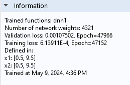
The information node indicates that the validation loss is approximately 1.1e-3 and the training loss is about 0.61e-3.
The Information section of the Deep Neural Network function Settings window.
Although these values are relatively close, the difference suggests we may be seeing the beginnings of overfitting. However, the Convergence Plot shows that the losses are fluctuating around similar values, which suggests that overfitting is not currently a significant concern. We can also see that the number of network parameters is 4321 for this network, a significant increase from the previous network's 93.
Visualizing the Quality of the Fit for the Larger Network
We can visualize the new absolute difference by simply clicking on the last 2D Plot Group.
 The Model Builder with the Surface 1 node under 2D Plot Group 4 selected and the corresponding Settings window and Graphics window, which displays a 2D plot of a circle with a rainbow color distribution that is majority varying shades of blue.
A visualization of the new absolute difference between the functions.
The Model Builder with the Surface 1 node under 2D Plot Group 4 selected and the corresponding Settings window and Graphics window, which displays a 2D plot of a circle with a rainbow color distribution that is majority varying shades of blue.
A visualization of the new absolute difference between the functions.
The maximum difference is now about 0.0095, which is significantly lower than the value of 0.065 for the previous, smaller network.
The model file for this neural network function example is available for download here.
Comparing to Ground Truth
In actuality, we know the exact form of the function surface. The dataset was synthesized by sampling points from the surface:

This expression defines our "ground truth" that we can compare both the neural network and linear interpolation functions to. To make this comparison, define an Analytic function by selecting it from under Global Definitions > Functions. Enter the following in the settings for the expression and the arguments:
| Expression | Arguments |
|---|---|
| 0.25*cos(x1)+0.2*cos(1.5*x2)*exp(-0.1*x1+0.025*x2)+0.1*x2 | x1,x2 |
 A close-up view of part of the Model Builder with the Analytic function selected and the corresponding Settings window, showing the Definition section of the settings.
The settings for the Analytic function.
A close-up view of part of the Model Builder with the Analytic function selected and the corresponding Settings window, showing the Definition section of the settings.
The settings for the Analytic function.
Now, select the last 2D Plot Group, right-click, and select Duplicate. To compare with the linear interpolation function, change the expression for the absolute difference in the new 2D Plot Group to abs(an1(x1,x2)-int1(x1,x2)).
The resulting plot is shown below.
 The COMSOL Multiphysics UI showing the Model Builder with the Surface 1 node under 2D Plot Group 5 selected, the corresponding Settings window, and the Graphics window.
The absolute difference between the linear interpolation function and the ground truth.
The COMSOL Multiphysics UI showing the Model Builder with the Surface 1 node under 2D Plot Group 5 selected, the corresponding Settings window, and the Graphics window.
The absolute difference between the linear interpolation function and the ground truth.
The maximum difference is about 0.01.
Download the model file comparing the interpolation and DNN with the ground truth here.
To create a DNN ground truth plot for comparison, duplicate, again, the 2D Plot Group. To compare with the neural network function, change the expression for the absolute difference to abs(an1(x1,x2)-dnn1(x1,x2)).
 The Model Builder with the Surface 1 node under 2D Plot Group 6 selected and the corresponding Settings window and Graphics window.
The absolute difference between the deep neural network function and the ground truth.
The Model Builder with the Surface 1 node under 2D Plot Group 6 selected and the corresponding Settings window and Graphics window.
The absolute difference between the deep neural network function and the ground truth.
The maximum difference is about 0.01.
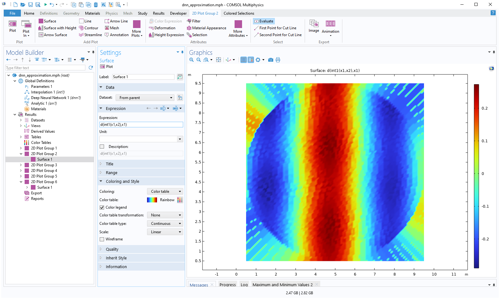
We see that the two methods give a similar level of accuracy. However, the neural network model defines a much smoother function than the linear interpolation function. We can see this by, for example, plotting the derivative in the x1 direction.
In the interpolation table plot, replace the expression int1(x1,x2) with d(int1(x1,x2),x1) for the derivative in the x1 direction. The resulting plot is shown below.
 The Model Builder with the Surface 1 node selected under 2D Plot Group 2 and the corresponding Settings window and Graphics window.
The derivative in the x1 direction of the linear interpolation function is visualized.
The Model Builder with the Surface 1 node selected under 2D Plot Group 2 and the corresponding Settings window and Graphics window.
The derivative in the x1 direction of the linear interpolation function is visualized.
In the neural network plot, replace dnn1(x1,x2) with d(dnn1(x1,x2),x1). The resulting plot is shown below.
 The Model Builder with the Surface 1 node selected under 2D Plot Group 3 and the corresponding Settings window and Graphics window.
A visualization of the derivative in the x1 direction of the deep neural network function.
The Model Builder with the Surface 1 node selected under 2D Plot Group 3 and the corresponding Settings window and Graphics window.
A visualization of the derivative in the x1 direction of the deep neural network function.
Download the model file with the derivative plots here.
We can also plot the function surfaces with a height attribute. For example, duplicate the interpolation plot and use the expression int1(x1,x2). Right-click the Surface node and select Height Expression. For the Scale Factor, in the Height Expression window, type 6. This produces the following plot:
 The Model Builder with the Surface 2 node selected under 2D Plot Group 7 and the corresponding Settings window and Graphics window..
Height is implemented in the 2D surface plot of the linear interpolation function.
The Model Builder with the Surface 2 node selected under 2D Plot Group 7 and the corresponding Settings window and Graphics window..
Height is implemented in the 2D surface plot of the linear interpolation function.
Now, in the same plot group, duplicate the Surface node and change the expression to dnn1(x1,x2). Also change the Color table to GrayScale. This produces the following visualization showing both surfaces in the same plot:
 The Model Builder with the Surface 2 node selected under 2D Plot Group 7 and the corresponding Settings window and Graphics window.
Height is implemented in the 2D surface plot of the deep neural network function, which uses a grayscale color table.
The Model Builder with the Surface 2 node selected under 2D Plot Group 7 and the corresponding Settings window and Graphics window.
Height is implemented in the 2D surface plot of the deep neural network function, which uses a grayscale color table.
In this plot we can also clearly see how the extrapolation differs between the two methods. Download the model file with these height plots here. A version using different activations (ReLU,Linear) is available here.
Submit feedback about this page or contact support here.